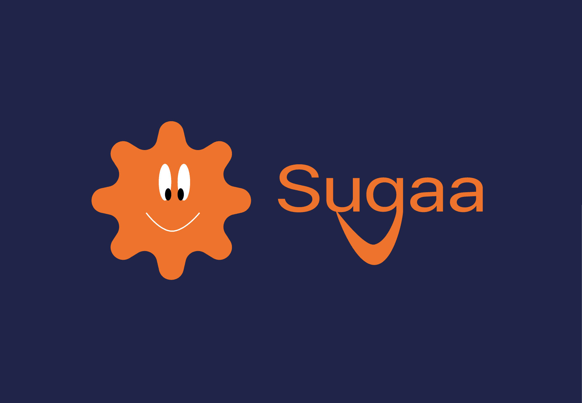
Sugaa
Brand design, Mobile Design, Interactive prototype

Client
Sugaa
Services
Brand design, Mobile Design, Interactive prototype
Timeline
1 week
Year
2024
A little background story: SUGAA was a design task I received as part of a job application.
The brief was simple:
Create a personal journaling app that helps users reflect daily with a unique feature where celebrities record short morning motivation messages for users.
There wasn’t a requirement to conduct research.
The focus was on turning an idea into a strong visual product.
So this project became less about UX discovery and more about:
How do I take a concept and turn it into something emotionally engaging, visually clear, and brand-aligned.
The Concept
SUGAA is a personal journaling app designed to:
Help users document their thoughts
Build consistency through daily entries
Receive motivational audio from celebrities
Start their day with positive energy
The app blends journaling with inspiration.
It isn’t just about writing. It’s about creating a mood.
My Role
For this task, I handled:
Brand identity design
Logo creation
Visual direction
UI design
Prototyping
This was an end-to-end creative execution project.
Brand Thinking
Before jumping into screens, I thought about the personality of SUGAA.
The name felt soft, sweet, and uplifting like “sugar” but spelled differently.
So I asked myself:
What should this brand feel like?
Warm
Encouraging
Calm
Modern
Slightly playful
I created:
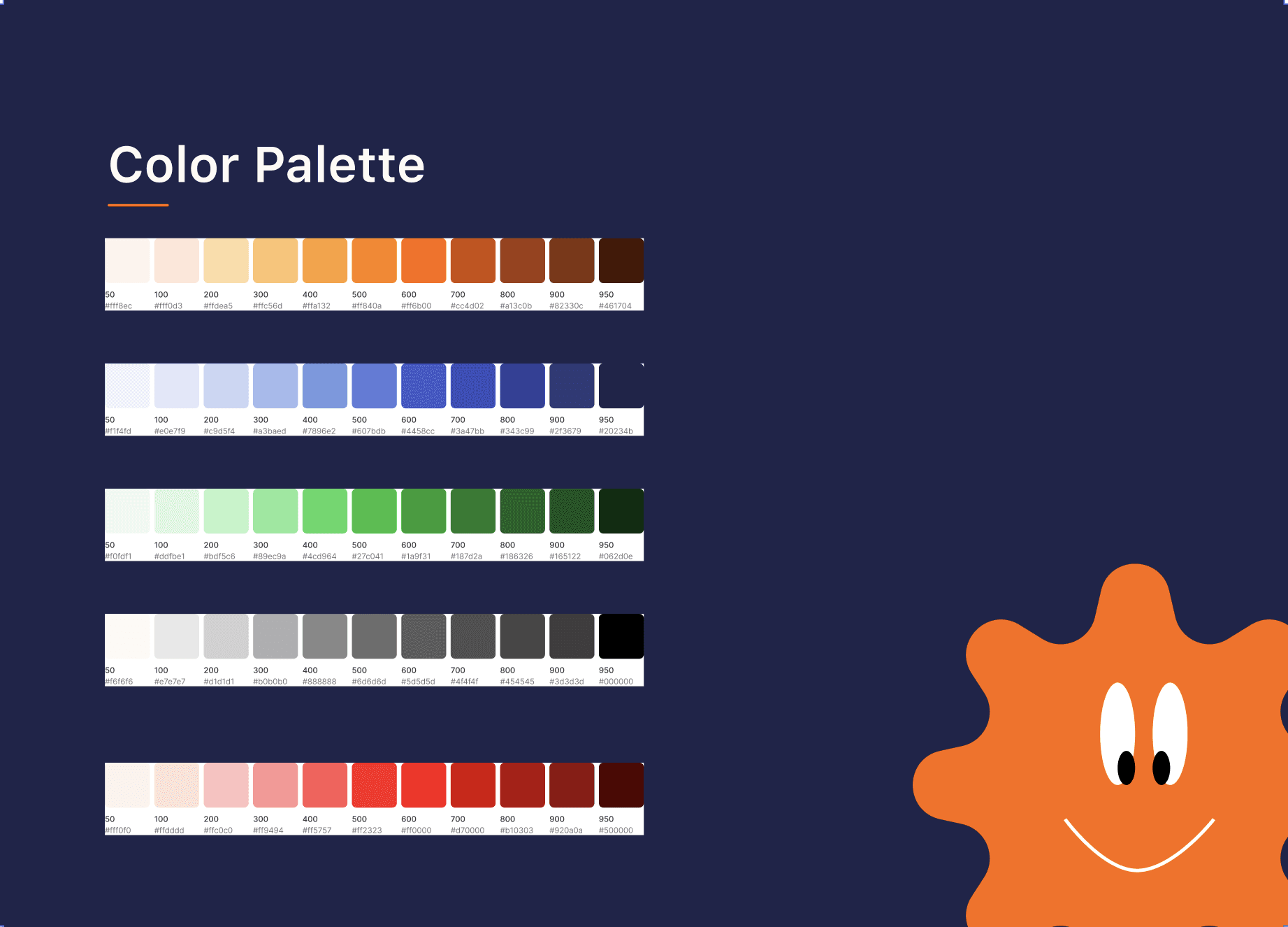
A soft but confident color palette
Clean typography for readability
Gentle gradients to create warmth
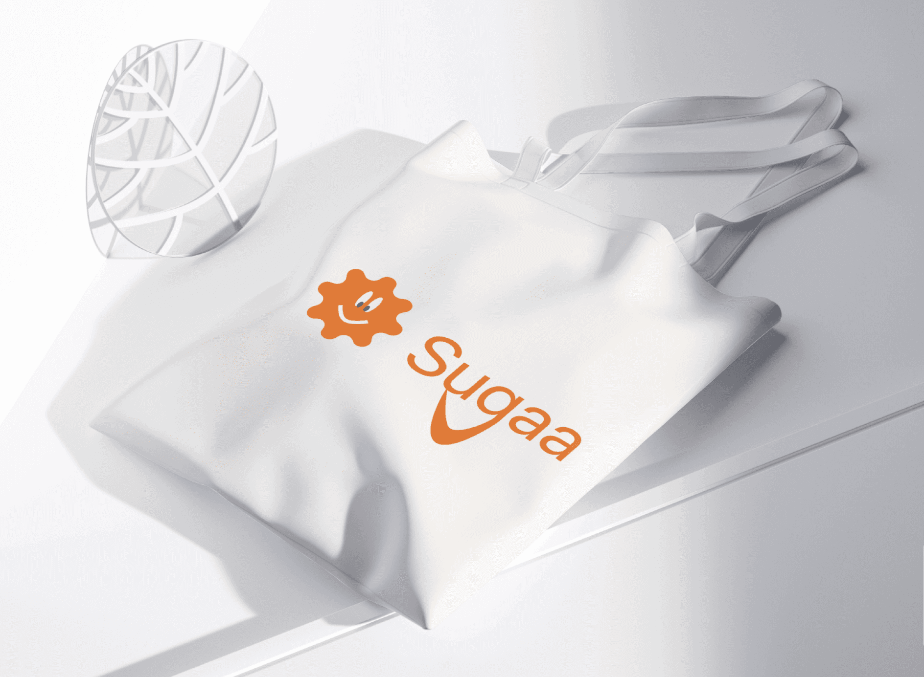
A logo that feels friendly and approachable
The goal was to design something that users would want to open every morning.
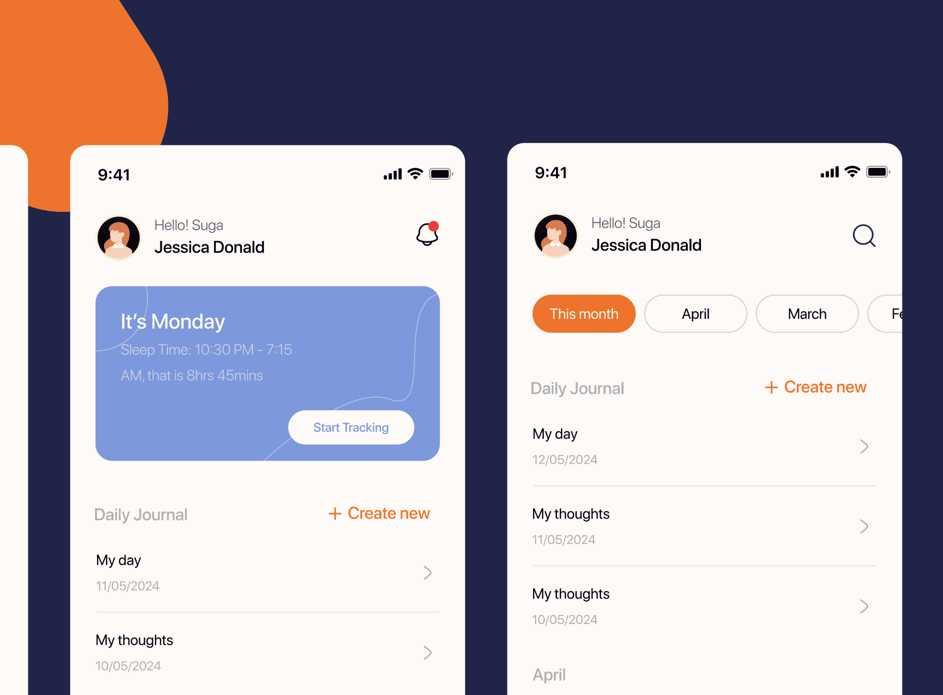
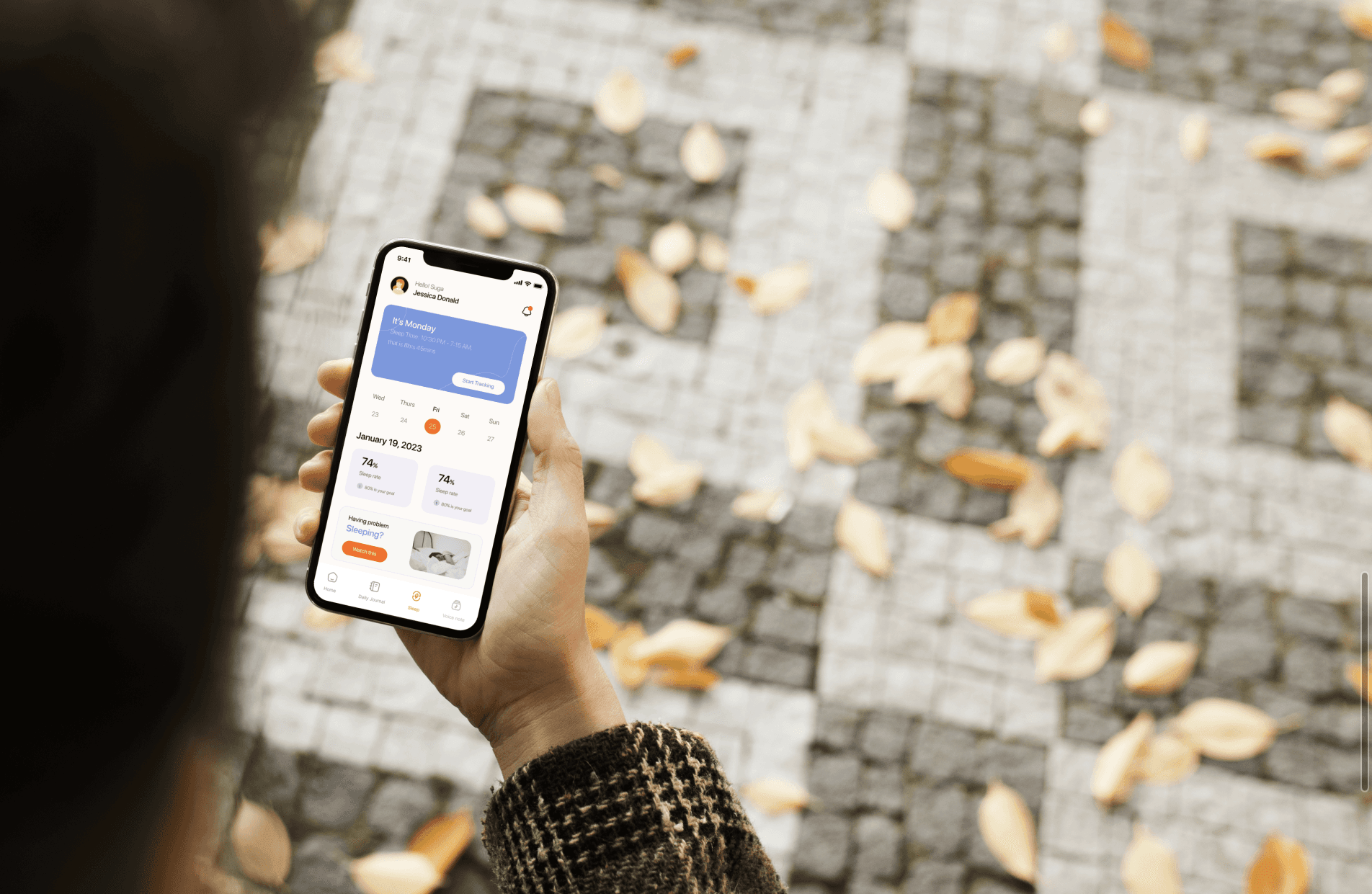
UI Direction
Because journaling is personal, I avoided clutter.
I focused on:
Clear hierarchy
Soft spacing
Simple navigation
Calm background tones
The celebrity audio feature was designed as a highlight moment, visually distinct but not overwhelming.
The journaling flow was kept simple:
Open app
Listen to motivation (optional)
Write entry
Save
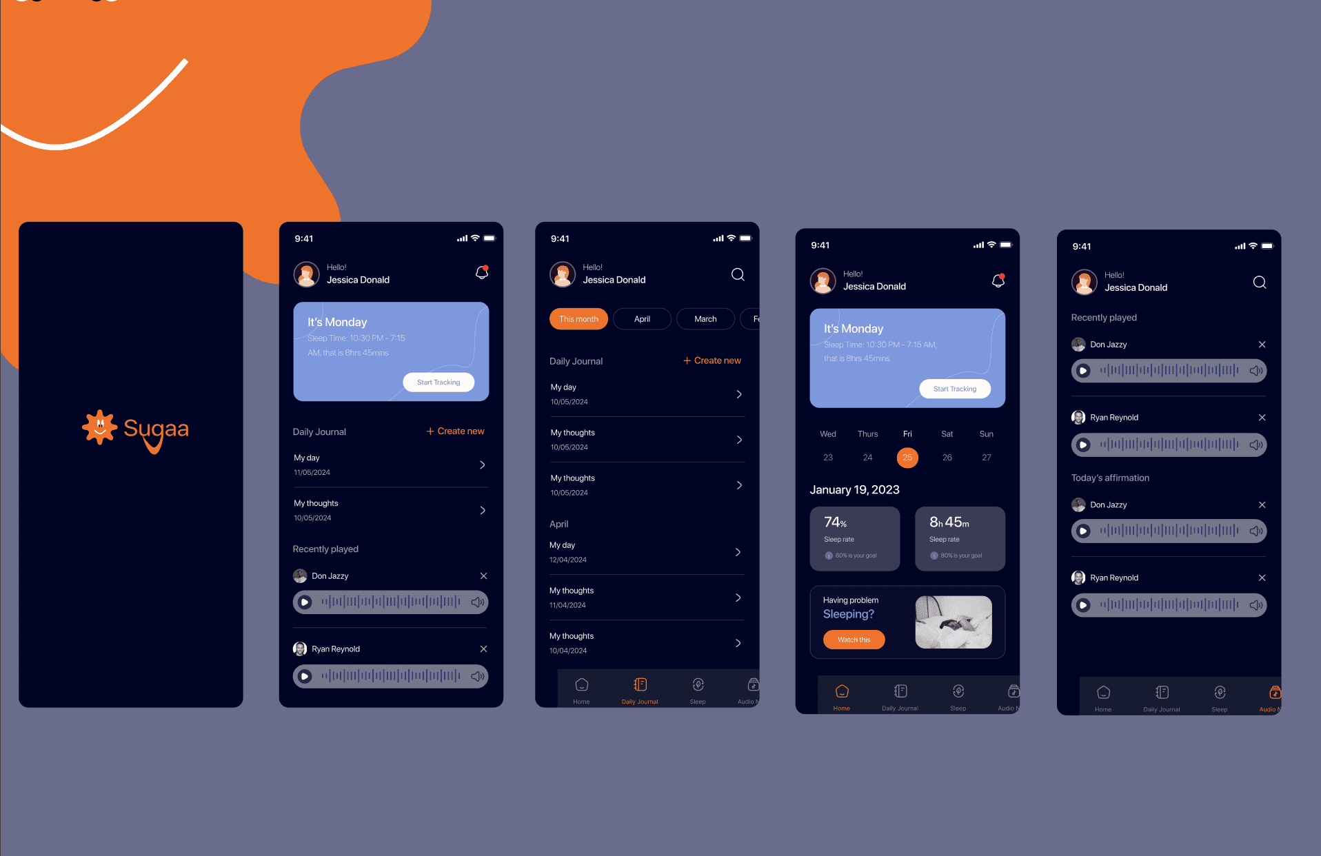
Design Decisions
Some intentional choices I made:
Used rounded components to make the interface feel softer
Avoided harsh contrast to maintain calmness
Made the CTA buttons clear but not aggressive
Since this was mainly a UI-focused task, attention to detail mattered:
Spacing, consistency, typography scale, and visual rhythm were very intentional.
What This Project Showcases
This case study isn’t about research-heavy UX.
It showcases:
My ability to translate ideas into visuals
My brand thinking
My creativity
My UI precision
My ability to design emotionally-driven products
It shows how I can take a concept and make it feel real.
What I Learned
Even when a project is “just UI,” it still requires thinking.
Designing emotional products requires:
Understanding tone
Designing for feeling, not just function
Consistency in visual language
Clarity in interaction
This project strengthened my ability to align brand identity with interface design.


