AI Resume Builder - AnalogueShifts
User Research, UI design (Version 2.0), Usability Testing

Client
AnalogueShifts
Services
User Research, UI design (Version 2.0), Usability Testing
Timeline
3 months
Year
2024
Job hunting is already stressful enough. You're sending applications, preparing for interviews, and somewhere in the middle of all that you still need a resume that looks good and actually gets past ATS filters.
AnalogueShifts built an AI Resume Builder to take that off people's plates. But the product wasn't landing the way it should. Users weren't signing up, and the ones who did weren't sticking around.
That's where I came in.
My Role
I was the Product Designer on this project. I handled the research, the UI redesign, developer collaboration, and design QA from the first survey to the final handoff.
Tools: Figma, Google Forms, Miro, Chatgpt
The Problem
When I joined, the brief was: improve the UI and increase retention. Simple enough, right?
Before we begin let's take a look on the landing page design we are having
So before I touched Figma, I wanted to understand what was actually going on with users. So I ran a survey reaching both existing users and a wider target audience. But before I sent out a single survey, I went back to basics. I asked the founders if there was a community of existing users I could talk to and there was. I started there, sitting with real people who had actually used the product, listening to what was working and what wasn't. Then I went wider. I reached out to the target audience beyond the community people who matched the user profile but had never touched the platform and sent surveys to both groups. I wanted the full picture: what existing users were struggling with, and what potential users needed to see before they'd even consider signing up
What came back was really interesting.
The numbers told a clear story:
🔴 33% of respondents had never used the platform — and when asked why, 100% of them said the same thing: "I didn't know about it."
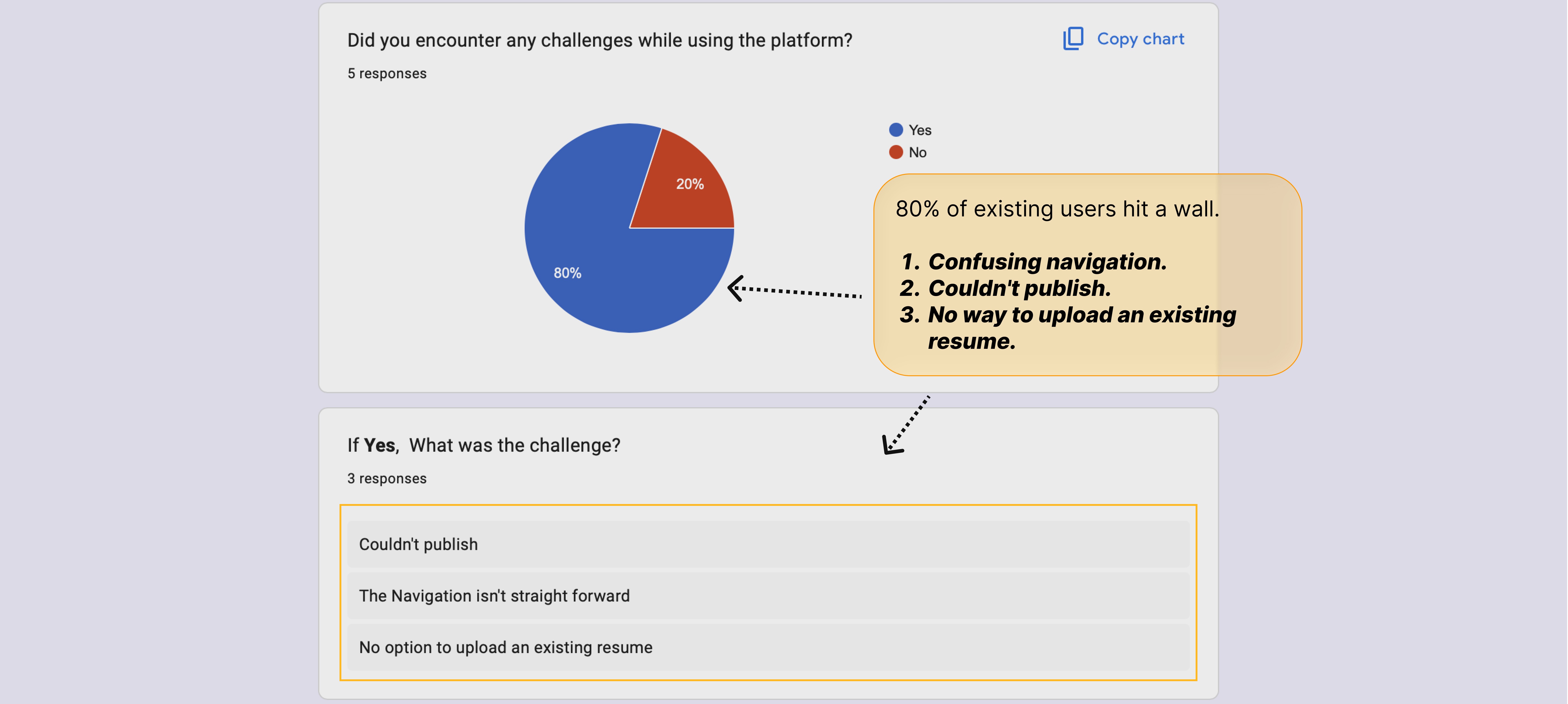
🔴 80% of existing users ran into challenges while using it — confusing navigation, couldn't publish their resume, no option to upload an existing one.
🔴 50% gave a recommendation score of 3 or lower out of 5. People weren't excited enough to tell their friends.
So the real problem wasn't just the UI. It was three things working together:
People didn't know the product existed
The ones who found it hit friction almost immediately
There was nothing compelling enough to make them stay or come back
WHAT USERS ACTUALLY WANTED
The features section of the survey was really telling. I asked users what they'd find most useful in an AI resume builder and the answers were clear.
83% wanted:
ATS-friendly resume templates
AI-powered writing suggestions
Job-specific resume optimization
50% wanted grammar and formatting checks.
These weren't nice-to-haves. These were the core reasons someone would choose one resume builder over another. And when I asked users who'd tried other platforms what would make them stick with AnalogueShifts — they literally said:
"Introduce a 2-week free trial instead of instant payments"
"If there's an option to check if my resume will pass the ATS system… then yes, I'm sticking around"
That last one hit different. Users were telling us exactly what they needed. My job was to design for it.
THE DIRECTION
After sharing findings with the founder and stakeholders, we aligned on three priorities:
1. Add a free trial — two weeks, no payment required. Let users feel the value before asking them to commit.
2. Fix the navigation — users couldn't find their way around. Every key action needed to be obvious.
3. Redesign the landing page — if 33% of people didn't even know the product existed, the first impression needed to do a lot more work.
DESIGN PROCESS
I started by mapping the full user journey from landing on the homepage to actually publishing a resume. Then I looked at where the current experience was breaking down at each step.
From there I moved into wireframes, then full UI in Figma. I had regular check-ins with the dev team throughout to make sure everything I was designing could actually be built.
A few things I focused on heavily:
Making the free trial visible and prominent from the very first screen
Simplifying navigation so users always knew where they were and what to do next
Cleaning up the overall visual hierarchy so the product felt credible and easy to trust1. The UI felt cluttered and confusing
VALIDATION & OUTCOME
Before Redesign
After Redesign
I tested the updated designs with users who had seen the old version and asked for honest reactions.
The feedback was warm. The landing page especially — the founder and stakeholders responded really well to how clear and modern it felt. It finally looked like something worth stopping for.
The free trial was the decision that made the biggest difference. Users had literally asked for it in the survey — and seeing it designed into the product felt like the platform was actually listening to them.
The project was still in active development when some team changes happened, so full launch metrics aren't available. But the redesign passed stakeholder review, the dev team confirmed it was buildable, and the core friction points users raised in research were directly addressed in the final design.
WHAT I LEARNED
This project changed how I read a brief. I came in thinking the problem was the UI. The research told me the real problem was awareness and trust — and those need completely different solutions.
A few things I'm taking with me:
Always talk to users before opening Figma. The data will surprise you.
When users tell you what they want in their own words, design exactly that.
A free trial isn't just a business feature — it's a design decision about trust.