TaxEase
Brand design, Web Design

Client
Tax Ease
Services
Brand design, Web Design
Timeline
2 Weeks
Year
2024
Taxes can feel overwhelming.
For individuals and small businesses, managing tax records, tracking payments, and filing correctly is stressful, especially when systems feel complicated or outdated.
TaxEase (T-A-X-E-A-S-E) was introduced as a web-based tax management system designed to simplify that process.
This was a design task where the research and product direction were already defined. My role was to take those insights and turn them into a strong brand identity and a clean, easy-to-use interface.
My Role
For TaxEase, I was responsible for:
Naming exploration and brand identity design
Logo creation
Landing page design
Onboarding flow design
Dashboard UI design
High-fidelity prototyping
The goal was to visually communicate trust, clarity, and simplicity while making tax management feel less intimidating.
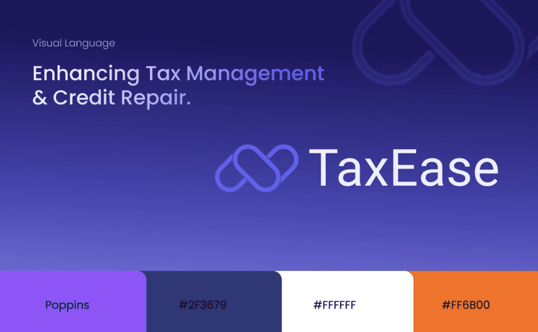
Brand Direction
When designing for a tax product, trust is everything.
I knew the brand needed to feel:
Professional
Secure
Structured
Clear
Modern
I avoided playful colors or overly creative elements. Instead, I focused on:
A clean, structured layout
Strong typography
A calm, confident color palette
Clear visual hierarchy
The name “TaxEase” already communicates simplicity, so the visual identity needed to support that message.

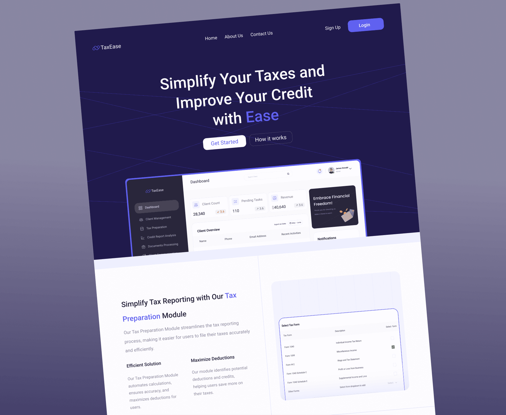
Landing Page Design
The landing page had one main purpose:
Build trust and drive sign-ups.
I structured it to:
Clearly explain what the platform does
Highlight key features (tax tracking, filing support, record management)
Show benefits in simple language
Use strong call-to-action buttons
Clarity was more important than decoration. Users visiting a tax platform want answers quickly.
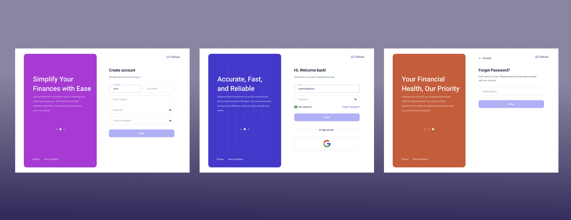
Onboarding Flow
For onboarding, I focused on:
Breaking complex information into steps
Clear input fields
Helpful microcopy
Logical progression
Tax-related forms can easily feel overwhelming, so spacing and grouping were very intentional.
The goal was to make users feel guided, not pressured.
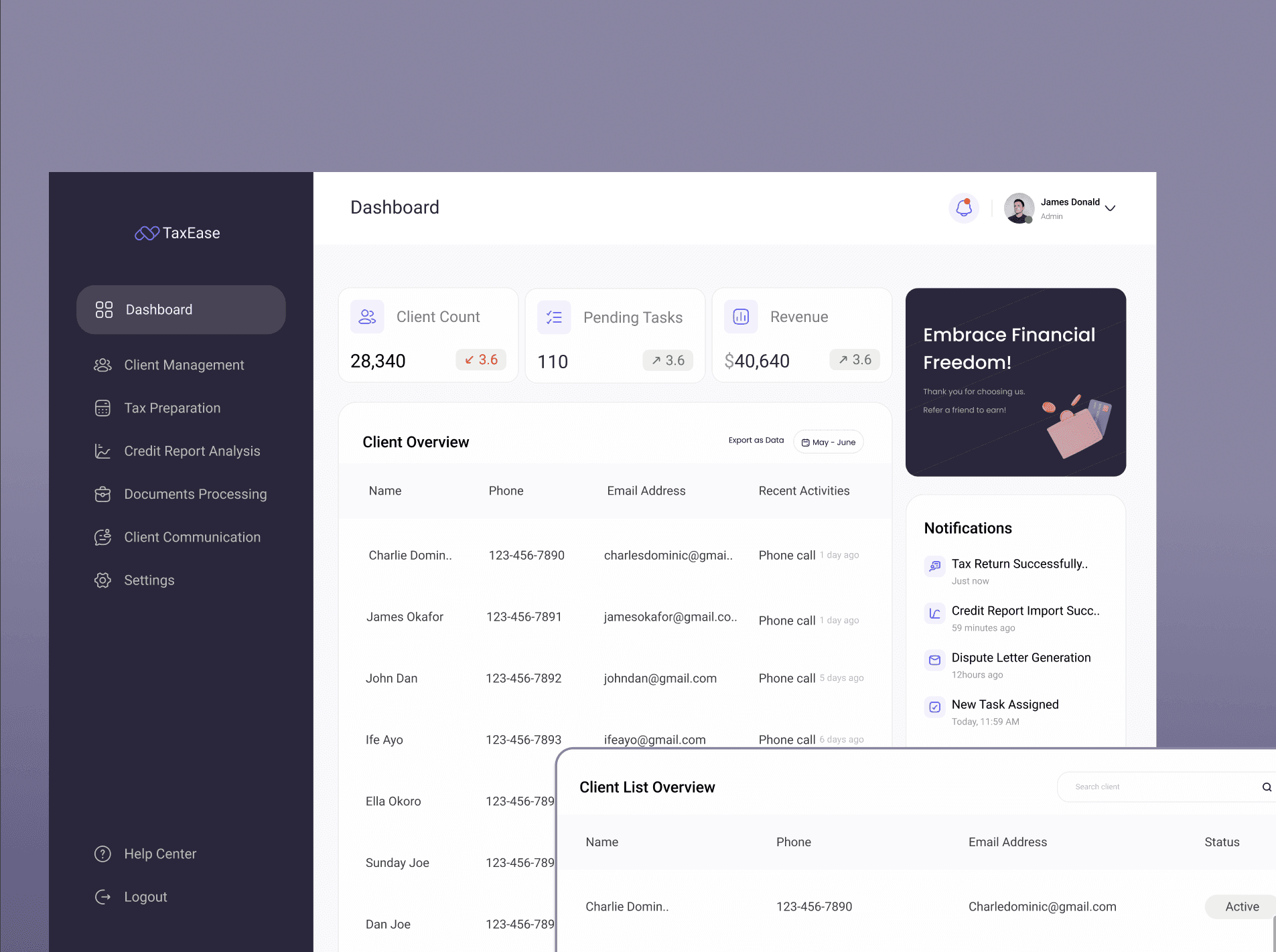
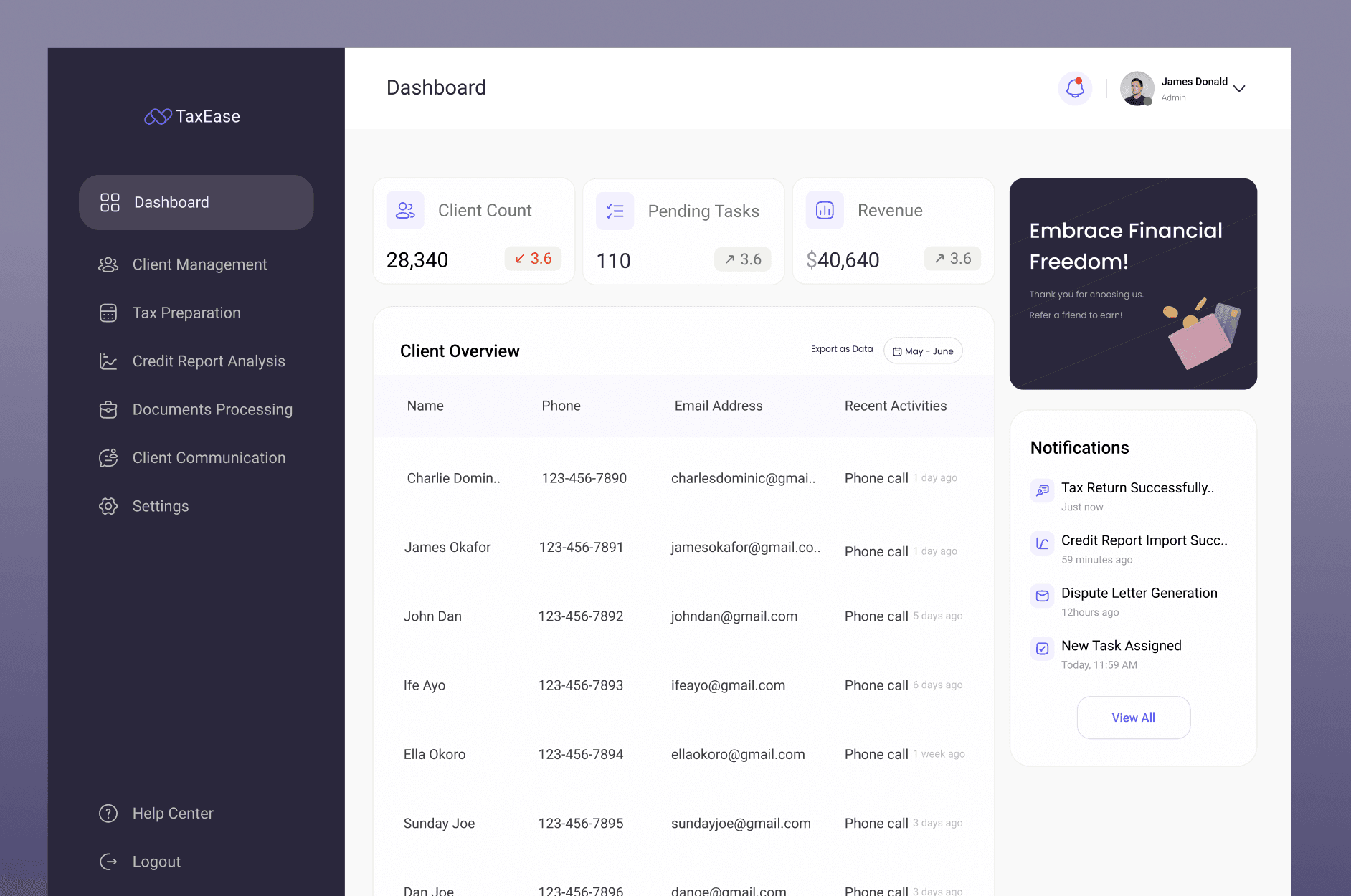
Dashboard Design
The dashboard was designed to feel structured and data-driven.
I focused on:
Clear data sections
Visual hierarchy for important information
Cards and grouped layouts
Readable financial summaries
Easy navigation
Since tax management involves numbers and records, I made sure the layout supported quick scanning and clarity.
Design Approach
Even though the research was already done, I treated this as a translation exercise:
How do I turn structured insights into an interface that feels simple?
I designed everything with:
Consistent spacing
Strong typography scale
Clear interaction states
Logical grouping of information
This project allowed me to focus on precision and visual system thinking.
What This Project Showcases
This case study highlights:
My ability to design in regulated/serious industries
Brand thinking aligned with business goals
Structuring complex dashboards
Designing onboarding for data-heavy products
Creating visual systems for web applications
It demonstrates that I can design not just creative apps, but also structured business platforms.
What I Learned
Designing for finance and tax products requires:
Clarity over creativity
Trust over decoration
Structure over experimentation
This project strengthened my ability to design clean, professional interfaces that support complex user tasks.