Analogue Shifts
Brand Design, Mobile Design, Web Design, Landing Page

Client
Framer
Services
Brand Design, Mobile Design, Web Design, Landing Page
Timeline
1 year
Year
2024
Job hunting today is not easy.
People apply to multiple roles, track applications, update resumes, and wait for responses, sometimes for weeks. On the other side, companies struggle to find the right talent and manage applicants efficiently.
That’s where talent platforms come in.
AnalogueShifts was built to bridge that gap.
It’s a platform where companies can post jobs, candidates can apply, and users can track their applications — all in one place.
During my time as a Product Designer at Analog Shifts, one of my main responsibilities was redesigning key parts of the product experience: the landing page, onboarding flow, and dashboard.
The goal was simple: make the platform clearer, easier to use, and more effective for both job seekers and employers.
My Role
I worked as the Product Designer on this project.
I was responsible for:
Reviewing the existing product experience
Gathering user feedback and insights
Redesigning the landing page
Improving onboarding flow
Redesigning the dashboard UI
Creating high-fidelity designs and prototypes in Figma
Collaborating closely with developers
Supporting implementation through design QA
I worked alongside stakeholders and engineers to ensure the designs were not just visually clean, but also feasible and aligned with product goals.
Understanding the Problem
Before redesigning anything, I spent time reviewing the existing experience.
A few issues stood out quickly.
The landing page didn’t clearly communicate what AnalogueShifts offered. While there was no direct call-to-action, the overall message felt weak, and users couldn’t easily understand the value of the platform at a glance.
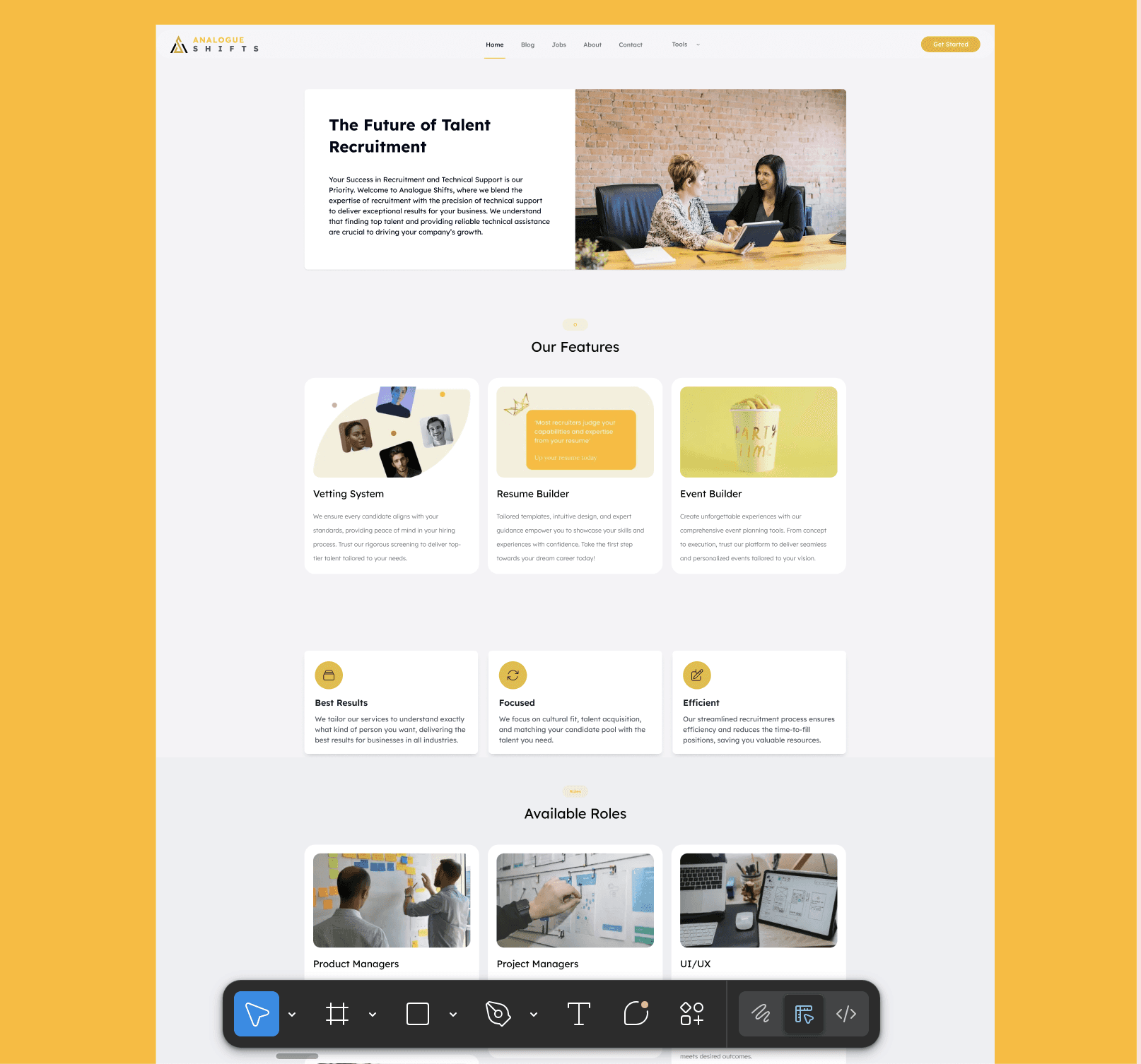
Onboarding also felt heavier than necessary. New users weren’t guided clearly, which made the first experience feel confusing.
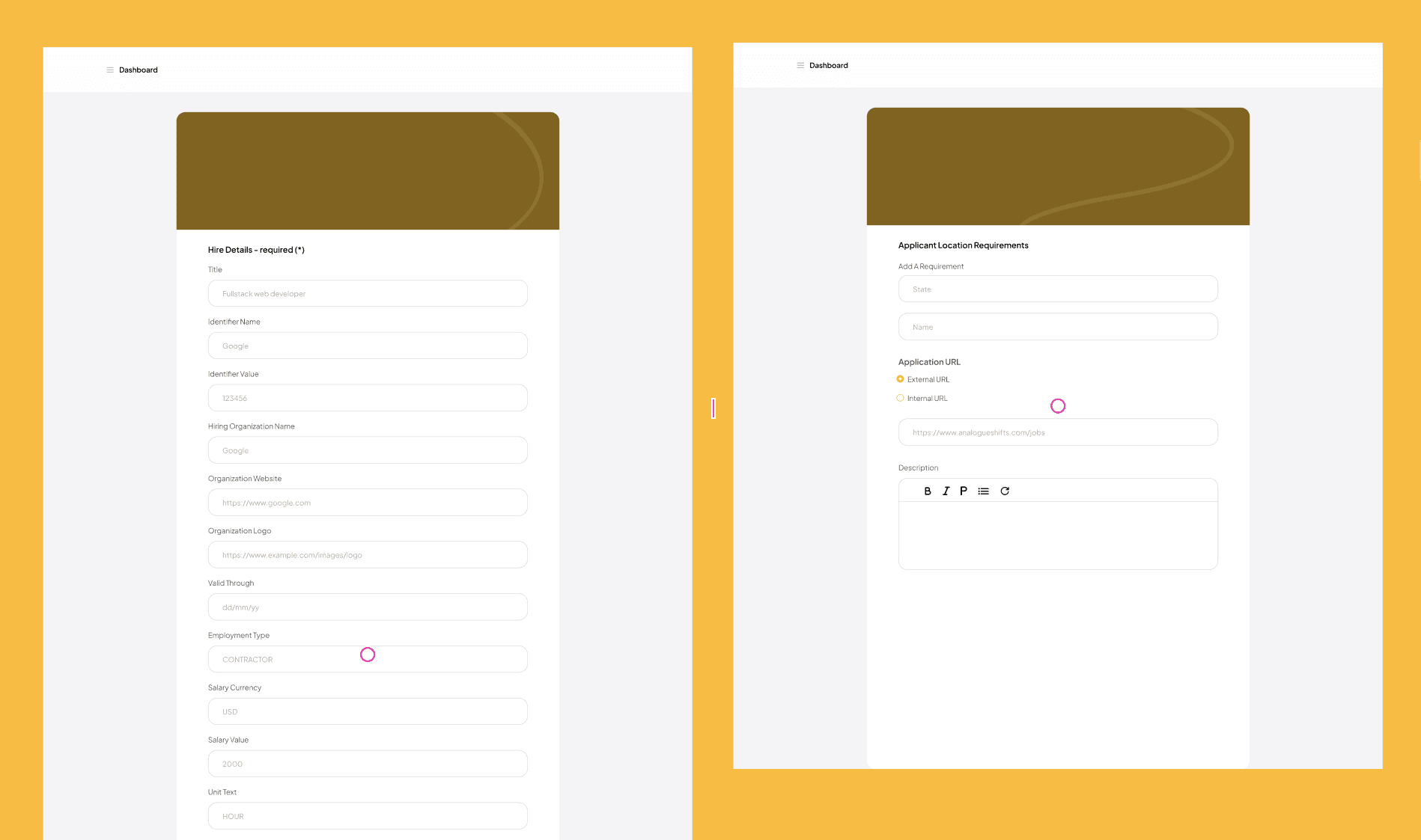
Inside the dashboard, information felt scattered. There wasn’t enough visual hierarchy, and users had to spend extra time figuring out where things lived.
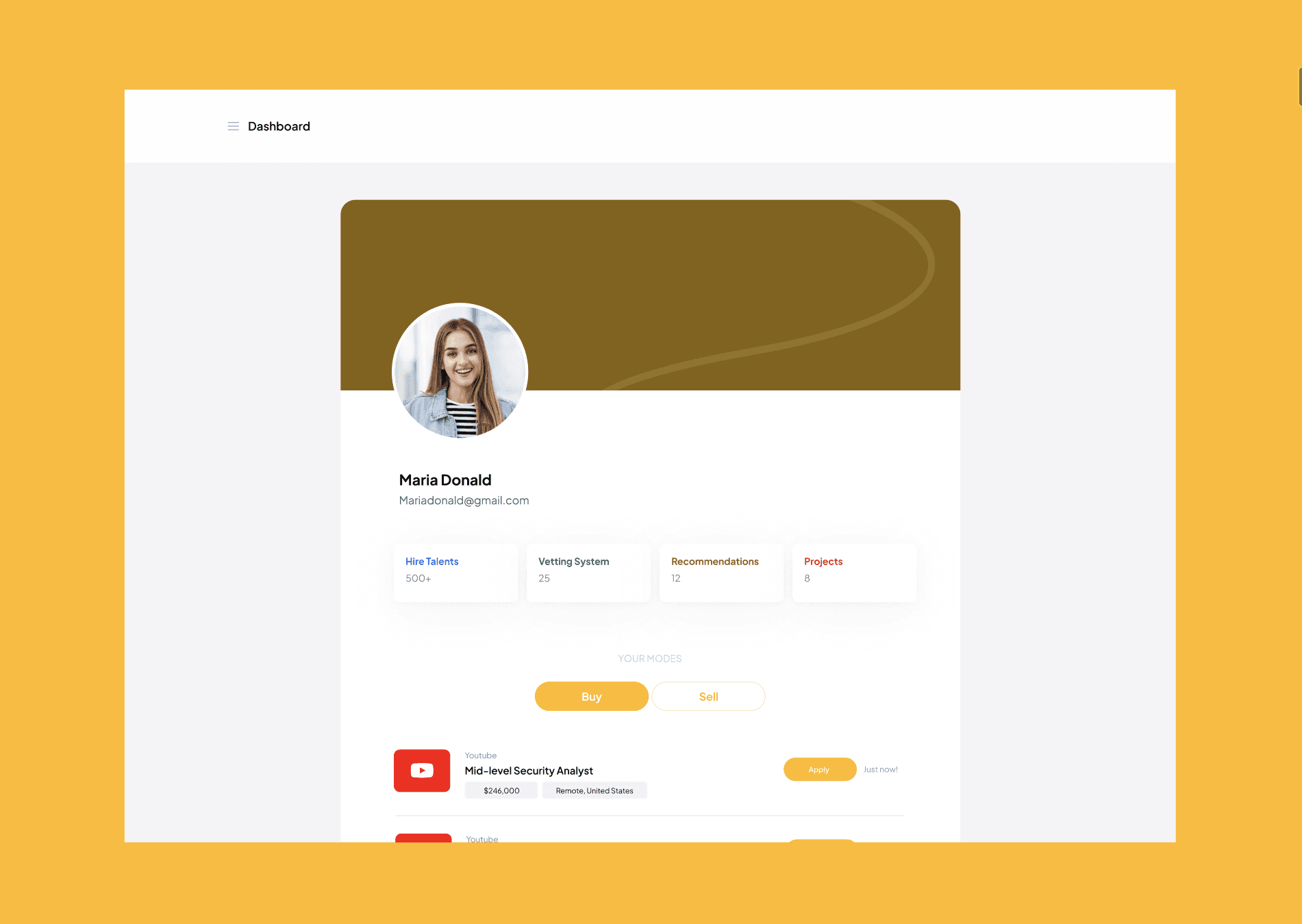
Overall, the platform worked but it didn’t feel smooth or intuitive.
And for a product focused on helping people find jobs, that friction mattered.
Research & Insights
I gathered feedback from users and stakeholders to understand where people were getting stuck.
Some users shared that:
The landing page didn’t clearly explain what the platform does
Navigation inside the product felt unclear
It wasn’t easy to immediately understand how to get started
I also reviewed similar talent platforms to understand common patterns and user expectations.
From this, a few priorities became clear:
The landing page needed to explain the product better and offer more entry points (sign up, search jobs, explore)
Onboarding had to feel lighter and more guided
The dashboard needed better structure and clarity
Design Direction
After aligning with stakeholders and developers, we focused on:
Improving product messaging on the landing page
Making it easier for users to sign up or start job searching directly
Simplifying onboarding
Redesigning the dashboard with clearer layout and hierarchy
The goal wasn’t to completely change the product, it was to make it easier to understand and easier to use.
Design Process
I started by mapping the full journey:
Landing page → onboarding → dashboard.
From there, I redesigned each section with clarity in mind.
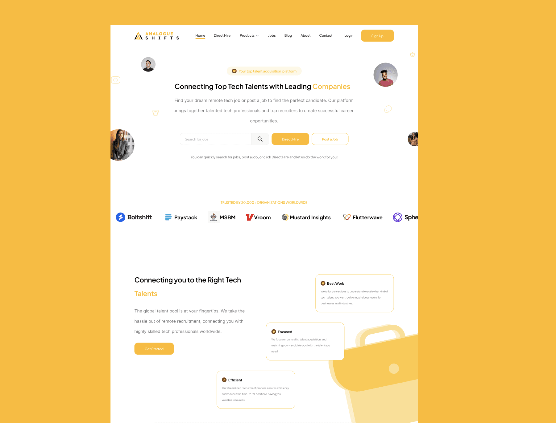
For the landing page, I focused on:
Clear messaging
Stronger visual hierarchy
Better CTAs
Making job search and sign-up more accessible
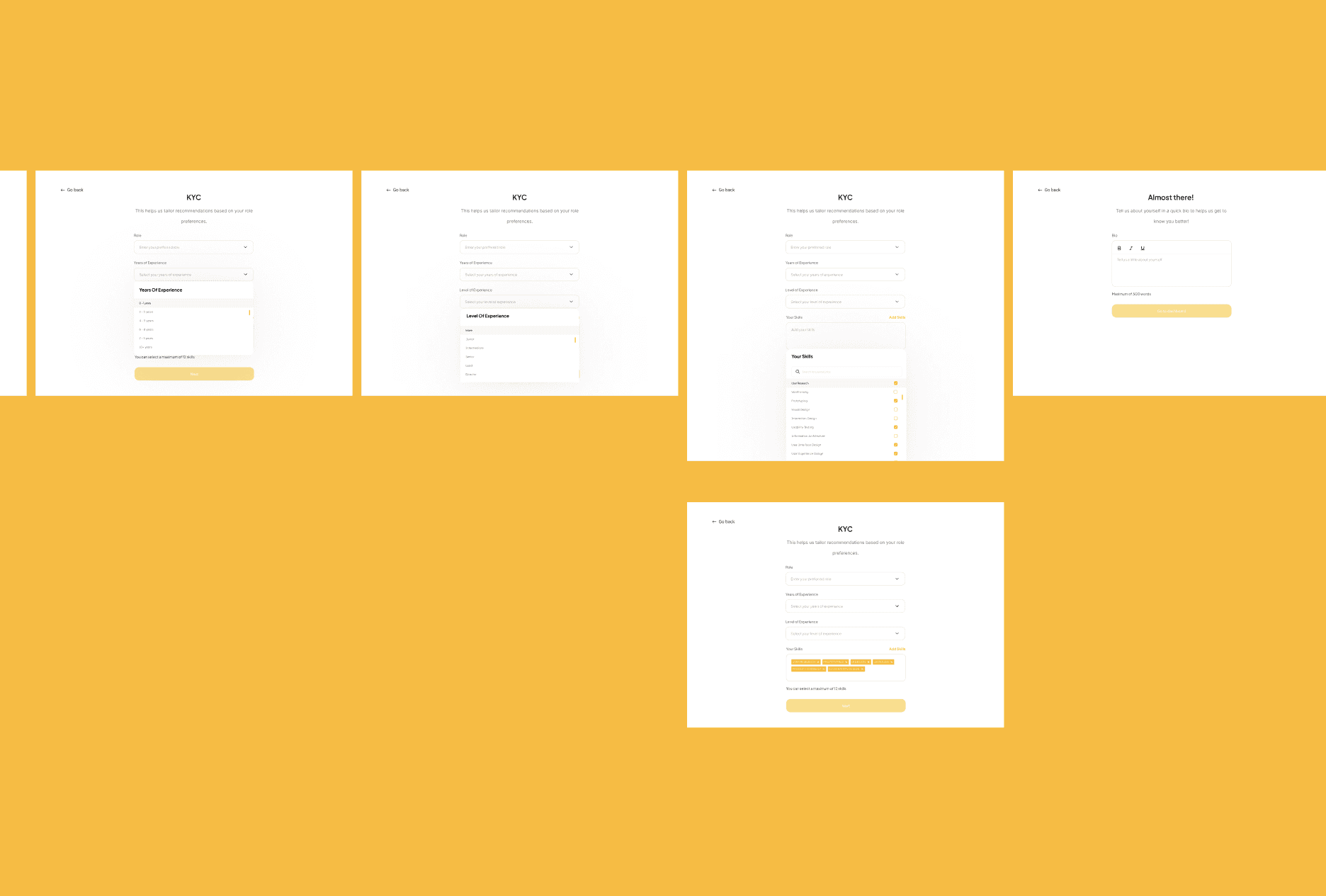
For onboarding, I worked on spacing, flow, and guidance so new users could move through the process with less friction.
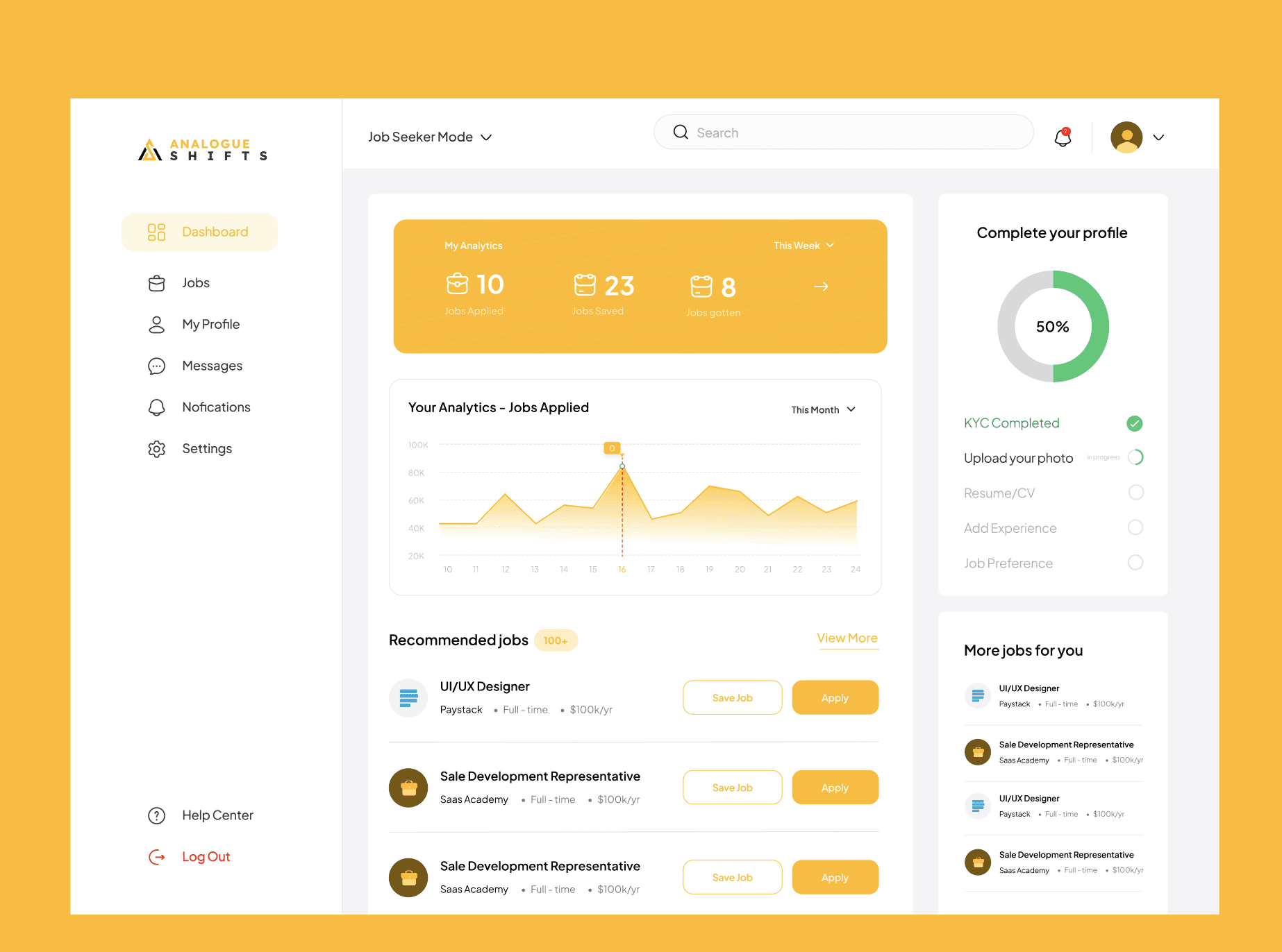
For the dashboard, I redesigned the layout to feel more structured and readable, helping users quickly see their applications, jobs, and activity.
All designs were created and prototyped in Figma, with regular check-ins with developers to make sure everything could be implemented properly.
Validation
To validate the redesign, I shared updated versions with users who had interacted with the earlier experience and gathered qualitative feedback.
Users said:
The flow felt clearer
The UI was easier to understand
Navigation made more sense
The overall experience felt more organized
Developers also confirmed that the new design improved usability and reduced friction across key flows.
These reflections helped confirm that the redesign addressed the original problems and created a smoother experience.
Outcome
After implementation:
The landing page communicated the product more clearly
Users could sign up or search jobs more easily
Onboarding felt lighter and more guided
The dashboard became cleaner and easier to navigate
The platform felt more approachable, especially for first-time users.
For me, the biggest win was turning a functional but confusing experience into something more structured and user-friendly.
What I Learned
This project reinforced a few important lessons:
Clear messaging matters just as much as good UI
First impressions define user trust
Small layout changes can greatly improve usability
Early collaboration with developers makes delivery smoother
Designing end-to-end flows creates better products than focusing on just designing screens
It also strengthened my ability to balance product thinking with practical execution, designing experiences that work for users while meeting business goals.


