Hostshifts
Branding, UI Design(Version 2.0), Design QA

Client
Hostshifts - Web hosting
Services
Branding, UI Design(Version 2.0), Design QA
Timeline
3 months
Year
2024
In today’s world, having your business online isn’t optional anymore.
Whether you’re running a small brand or building the next big startup, you need a website. And before that, you need hosting. You also need to know if your business name is available as a domain because getting your exact brand name online already feels like a small win.
That’s where web hosting platforms come in.
They help people register domains, host websites, and manage everything from one place.
HostShifts was built to do exactly that.
Funny enough, this project started in a very unexpected way.
A few days before Valentine’s Day, our founder jokingly told us he had a “Valentine’s gift” for the team. We all thought it was just banter until he revealed the gift was actually a new product project.
That product was HostShifts, a sister platform to AnalogueShifts.
Instead of chocolates or flowers, our Valentine’s gift was… work 😅
I was added to the HostShifts project as the Product Designer, and my task was clear:
Redesign the platform to improve conversion and make the experience easier from the first visit on the landing page all the way to the dashboard.
My Role
I worked on HostShifts as the Product Designer, focusing on the full user journey:
Landing page
Domain search
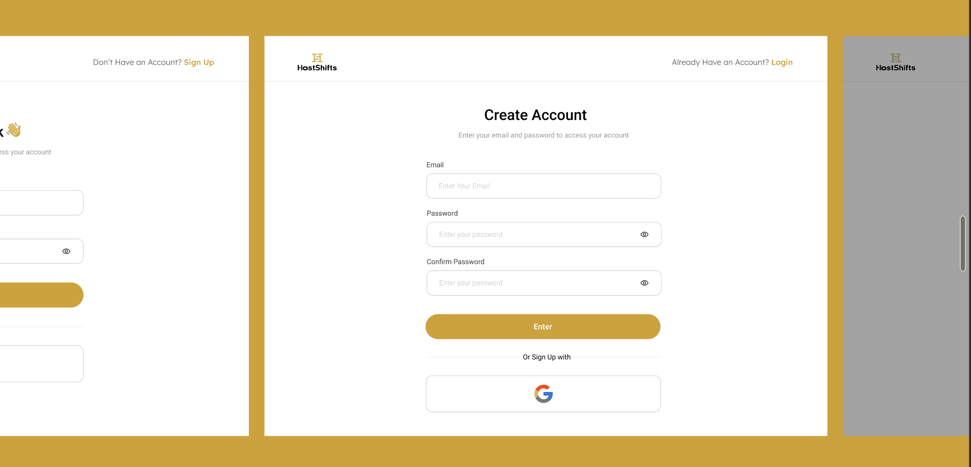
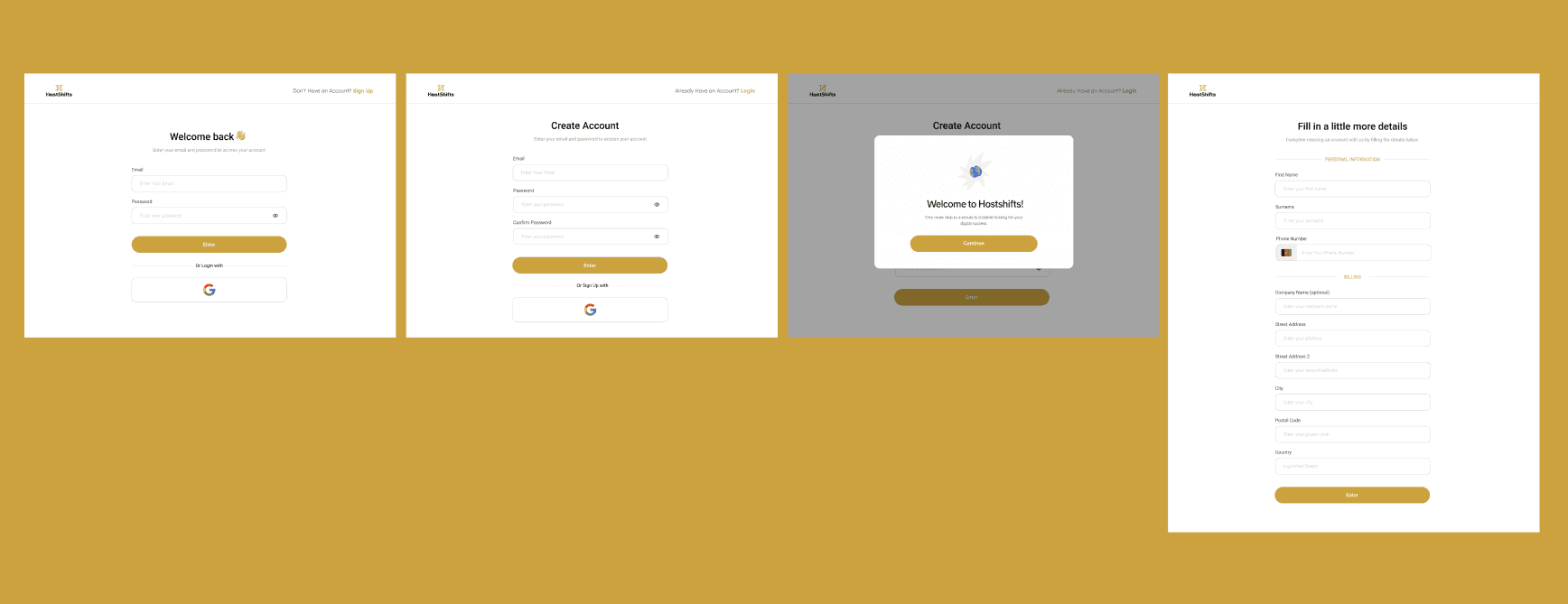
Registration & onboarding
Dashboard experience
I handled:
Product review and UX audit
User feedback gathering
Competitive analysis
Wireframing and UI design in Figma
Stakeholder communication
Collaboration with developers
Design QA after implementation
My main responsibility was improving the flow from entry point (landing page) to web app onboarding and making everything feel clearer and easier to use.
Understanding the Existing Experience
Before designing anything, I needed to understand what already existed.
So I:
Used the product myself
Reviewed the current landing page and web app
Spoke with stakeholders
Gathered feedback from people who had interacted with the platform
A few issues became clear:
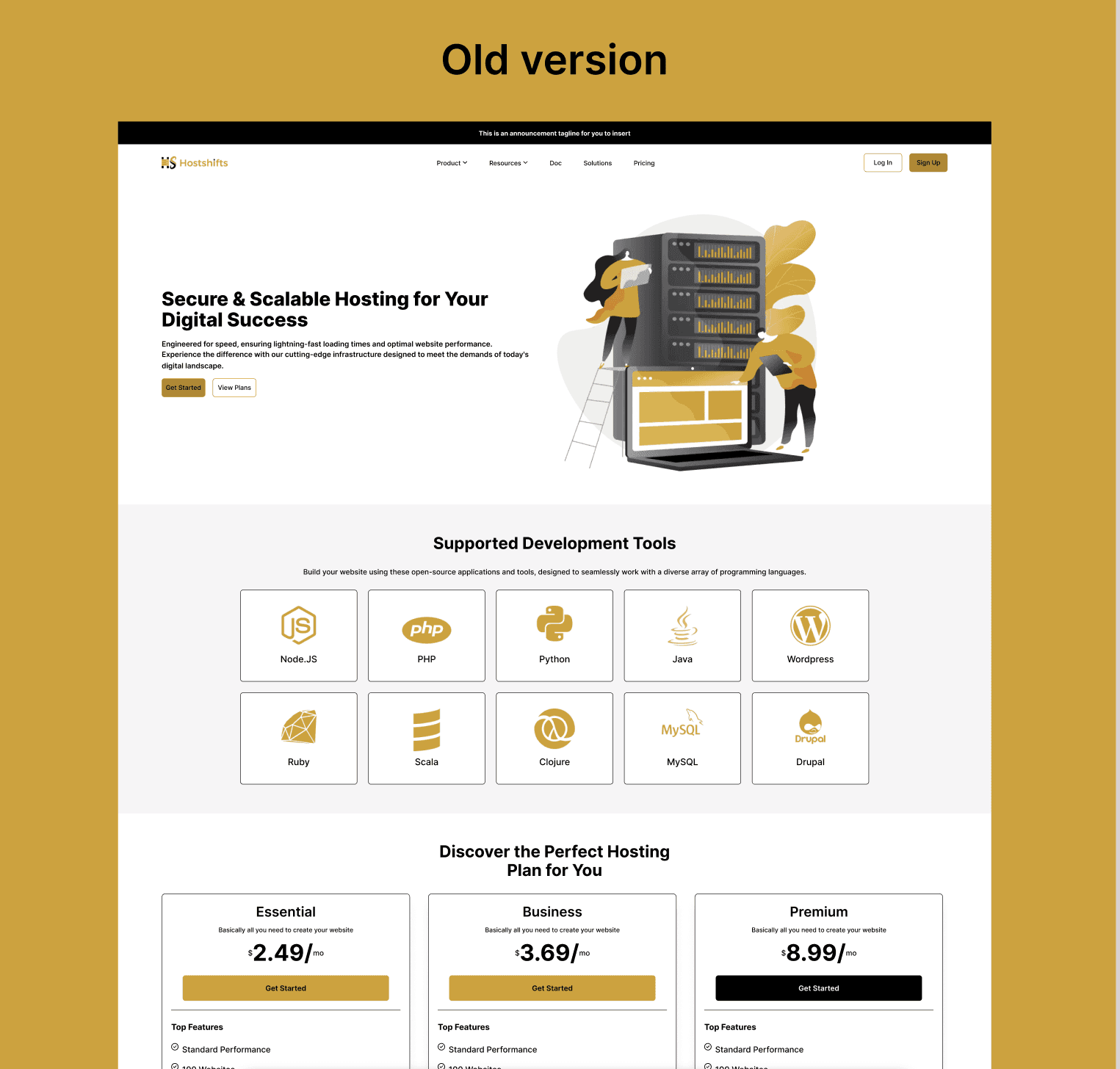
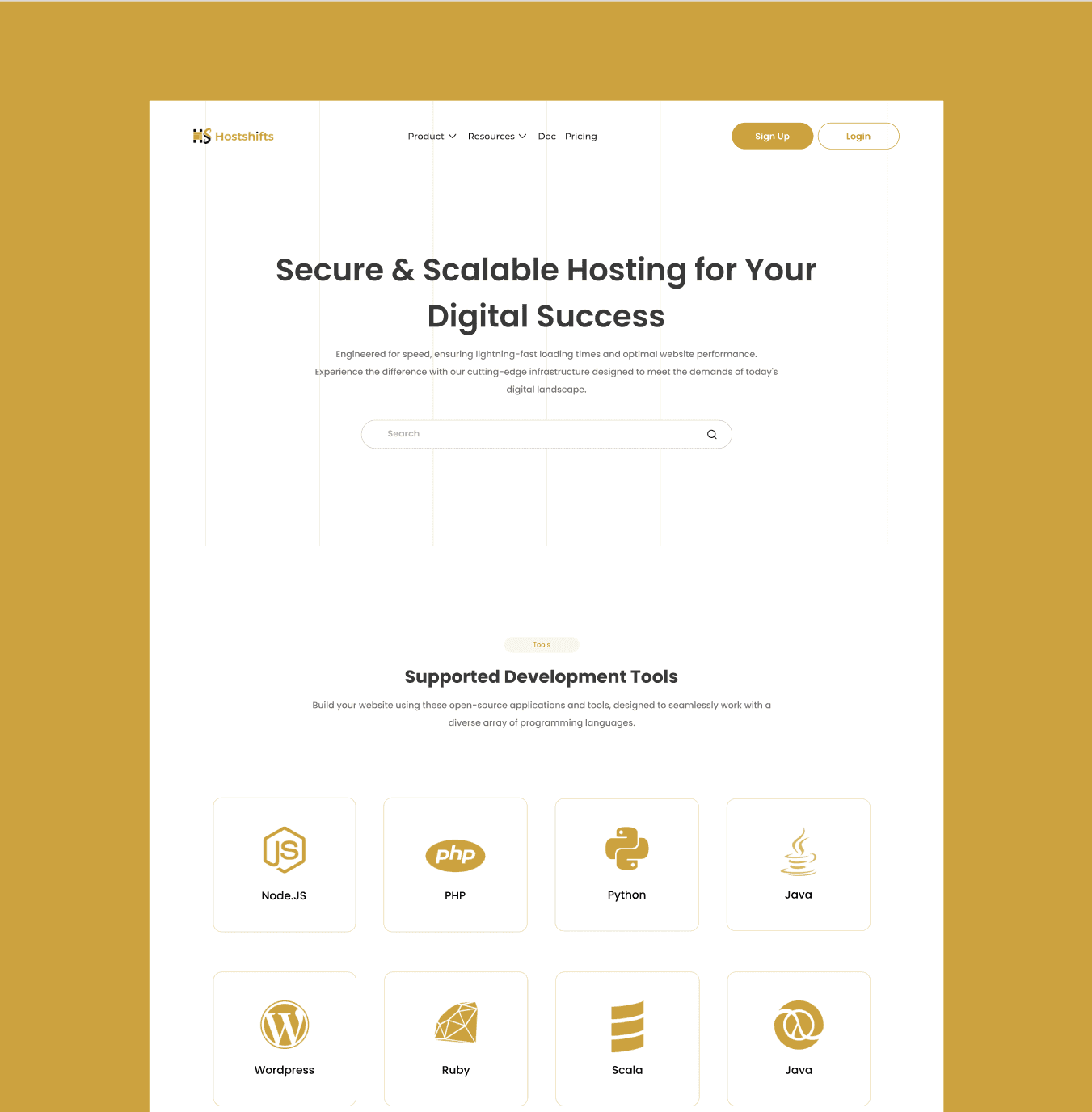
The landing page wasn’t very clear about what the product offered
Users couldn’t check domain availability directly from the landing page
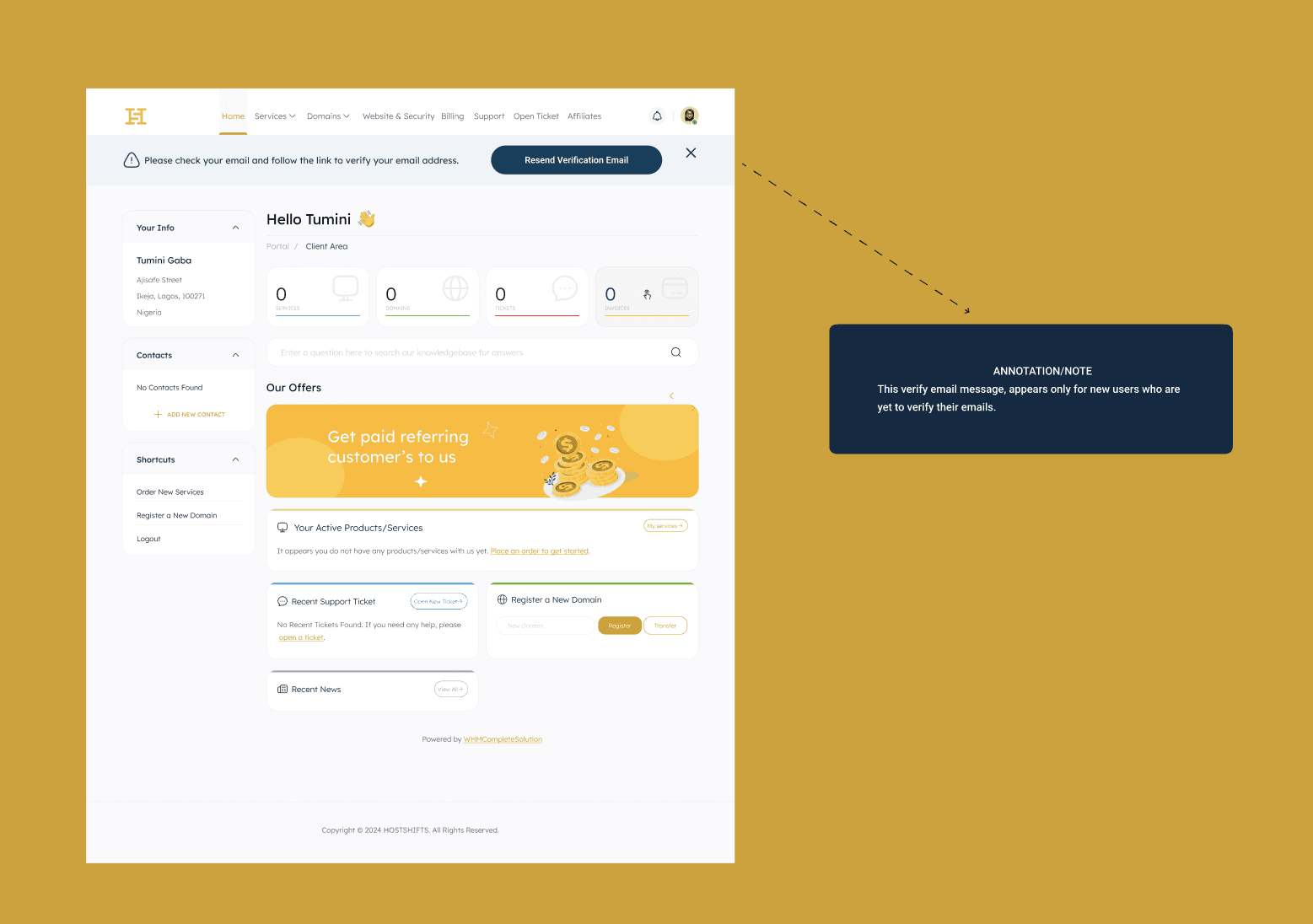
Navigation inside the dashboard felt heavy
Onboarding had friction, even though some fields couldn’t be changed for technical reasons
People didn’t feel guided. They had to figure things out on their own.
Research & Competitive Analysis
After gathering initial feedback, I did a quick competitive review of other hosting platforms to understand:
How they present pricing and features
How they handle domain search
How onboarding flows are structured
How dashboards are organized
This helped me identify patterns and opportunities we could adapt while still making HostShifts feel unique.
Design Constraints
One important part of this project was working within technical limits.
For example:
The dashboard had a fixed top navigation that couldn’t be changed
Some registration input fields were mandatory and couldn’t be removed
Certain layouts had to stay because of backend dependencies
I worked closely with the engineering team to understand these constraints early, so I didn’t design anything unrealistic.
The landing page gave me more freedom creatively, but the web app required more structure.
Defining the Direction
After aligning with stakeholders and developers, we focused on:
Making the landing page clearer and easier to understand
Adding domain search directly on the landing page hero section
Improving onboarding flow
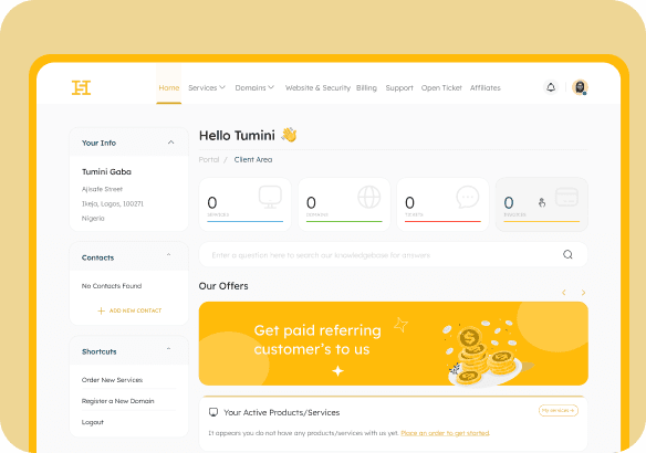
Cleaning up the dashboard UI while keeping the existing layout
Making navigation feel simpler and more intentional
The goal wasn’t to reinvent everything. It was to improve clarity and flow.
Design Process
I started with:
Mapping the full journey (landing → registration → dashboard)
Drafting wireframes
Designing UI screens
Reviewing feasibility with developers
Iterating based on feedback
I designed everything in Figma and had regular check-ins with the dev team to make sure what I was creating could actually be implemented.
For onboarding, even though some input fields were fixed, I focused on spacing, hierarchy, and guidance to make it feel lighter.
For the dashboard, I worked around the existing top navigation and focused on improving content layout and readability.
Implementation & QA
After design handoff, I supported implementation and did design QA to ensure:
Layouts matched designs
Spacing and hierarchy were respected
Key flows worked as expected
After launch, I did gather feedback from users who interacted with the new version.
Outcome
Based on qualitative feedback:
The landing page became clearer and easier to understand
Users could now search domain availability directly from the homepage
Navigation felt more straightforward
Onboarding became smoother
The dashboard looked cleaner and more structured
These improvements helped create a better first impression and reduced friction across the product. From feedback showed increased user confidence and easier navigation.
What I Learned
This project taught me a lot about designing within constraints.
Some key takeaways:
You don’t always get full creative freedom and that’s okay
Early collaboration with engineers saves time
Small UX improvements can significantly impact conversion
Designing the full journey (not just screens) creates better experiences
It also strengthened how I balance product thinking with practical delivery making sure designs are not only clean, but buildable.